Interpret diagrams for single-variable data, including understanding that area in a histogram represents frequency. Connect to probability distributions.
Guidance
Students should be familiar with histograms, frequency polygons, box and whisker plots (including outliers) and cumulative frequency diagrams.
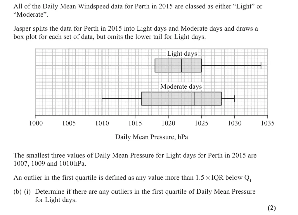
June 2025 · AS Paper 2 (Statistics) · Q2(b)(i)2 marks
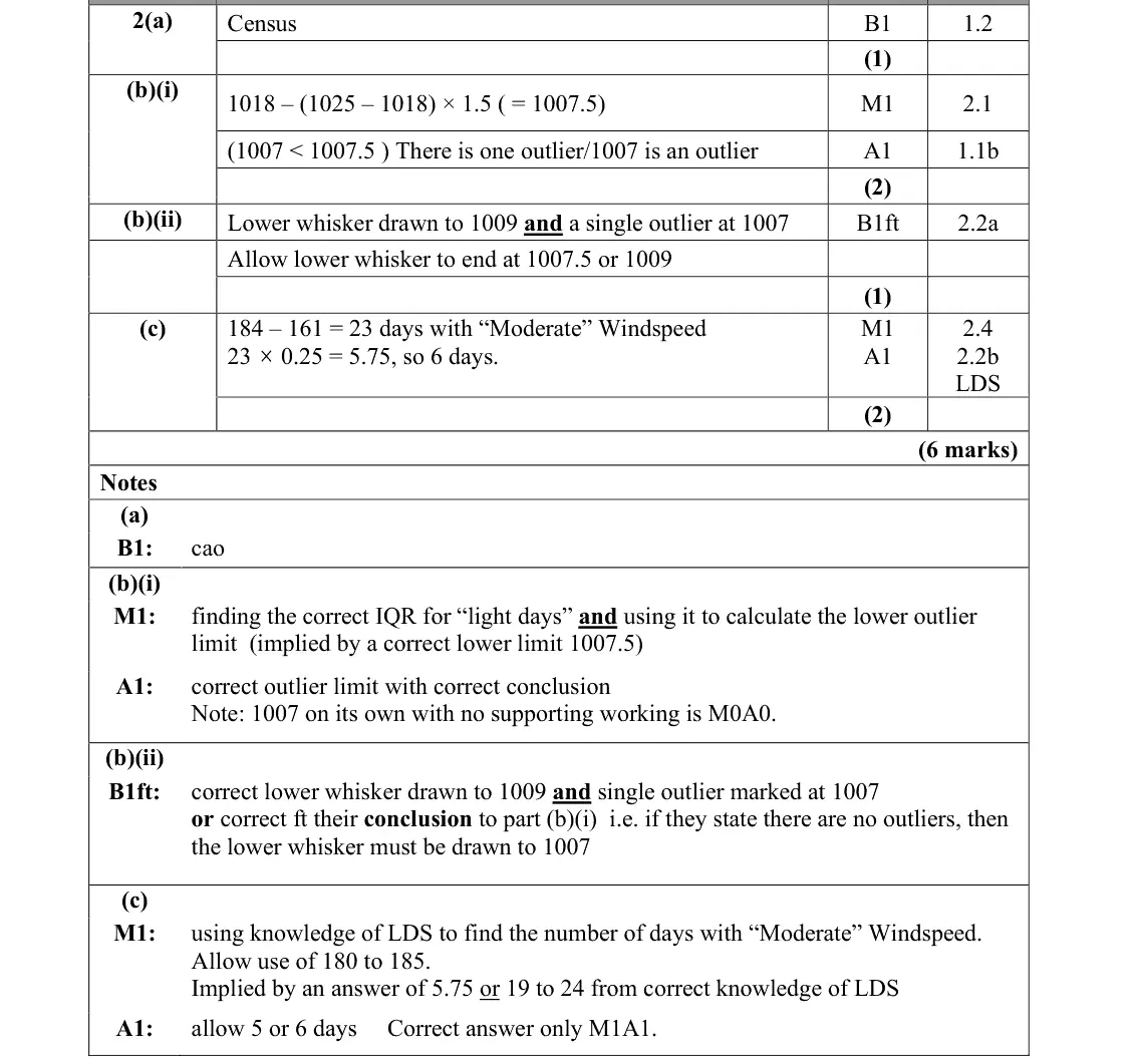
Mark scheme (whole question; this part is marked with the orange bar)
Examiner's comment
Most students were able to complete part (b)(i), calculating the lower outlier limit correctly and then showing that 1007 was an outlier. The most common mistakes were calculating 1007.5 but then concluding there were no outliers or only finding the IQR and thus attaining no marks. The drawing of outliers on a boxplot caused problems, with many students getting (b)(i) correct but then being unable to illustrate this correctly on the box plot. Often students made bottom whisker end at 1009 but did not mark in the outlier. There was also a significant minority who were unable to read the scale correctly when plotting values. There was follow through available in (b)(ii) for those who made a slip calculating the lower outlier limit in
Common mistakes
read Q1 = 1018 and Q3 = 1025 from the box plot
limit 1018 − 1.5 × 7 = 1007.5
conclude 1007 is the only outlier (1007 alone with no working scores 0)
some found 1007.5 then said there were no outliers, or found only the IQR
June 2025 · AS Paper 2 (Statistics) · Q2(b)(ii)1 mark
Mark scheme (whole question; this part is marked with the orange bar)
Examiner's comment
through available in (b)(ii) for those who made a slip calculating the lower outlier limit in part (i).
Common mistakes
lower whisker to 1009 (1007.5 allowed) and a single outlier marked at 1007
many drew the whisker but did not mark the outlier, or misread the scale
June 2025 · AS Paper 2 (Statistics) · Q2(c)2 marks
Mark scheme (whole question; this part is marked with the orange bar)
Examiner's comment
Part (c) proved more challenging for most, demonstrating that students are still not familiar with the large data set and how to apply it to a scenario. Of the students who were able to successfully identify the number of moderate days, most were able to make use of the upper quartile to arrive at a correct estimate of 5 or 6 days. A small number of students calculated three quarters of the days instead of one quarter.
Common mistakes
needs LDS knowledge that Perth 2015 has 184 days (May to October) so 184 − 161 = 23 Moderate days
1028 is the upper quartile for Moderate days so a quarter: 23 × 0.25 = 5.75, so 5 or 6 days
some used three quarters
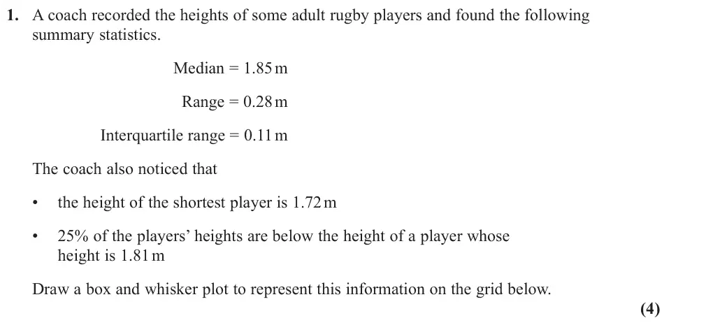
June 2024 · AS Paper 2 (Statistics) · Q14 marks
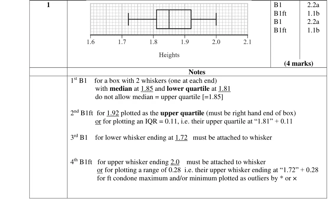
Mark scheme (whole question; this part is marked with the orange bar)
Examiner's comment
This question proved to be a successful start to the paper for most students, with many scoring full marks. Those who struggled did not recognise that 25% of the players' heights represented the lower quartile. They were still able to draw the interquartile range to the correct distance. Most students were able to correctly draw the whiskers for the lower and upper values, but there were a small minority who have no idea what a box and whisker diagram should look like, and some just plotted points or simply vertical drew lines.
Common mistakes
"25% below 1.81" means Q1 = 1.81
Q3 = 1.81 + 0.11 = 1.92
whiskers from 1.72 to 1.72 + 0.28 = 2.00
median 1.85 inside the box (not equal to Q3)
some plotted points or vertical lines only
June 2024 · AS Paper 2 (Statistics) · Q3(a)2 marks
Mark scheme (whole question; this part is marked with the orange bar)
Examiner's comment
Part (a) was well attempted and almost all students realised that the two missing frequencies should sum to 32.
Common mistakes
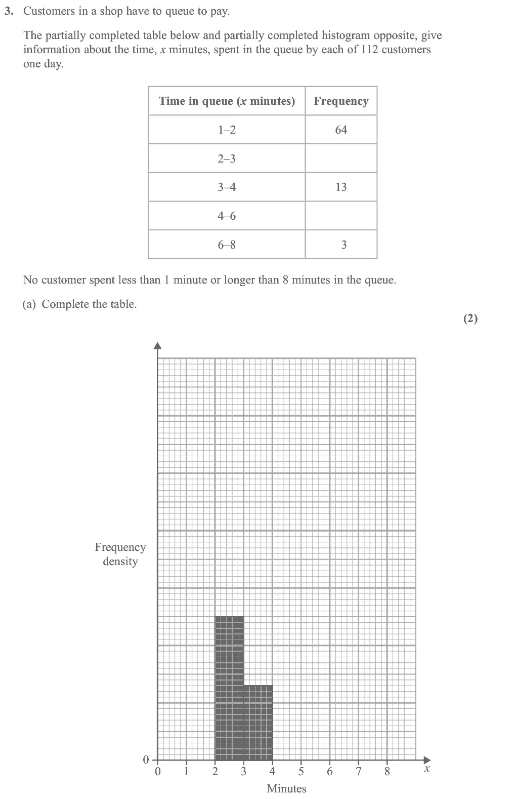
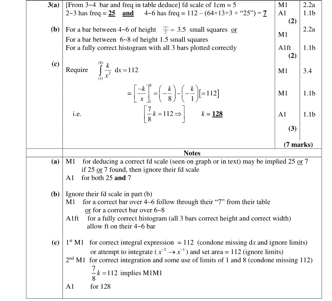
deduce the frequency density scale from the 3–4 bar (frequency 13)
2–3 has frequency 25 and 4–6 has 112 − (64 + 25 + 13 + 3) = 7
the two missing frequencies sum to 32
June 2024 · AS Paper 2 (Statistics) · Q3(b)2 marks
Mark scheme (whole question; this part is marked with the orange bar)
Examiner's comment
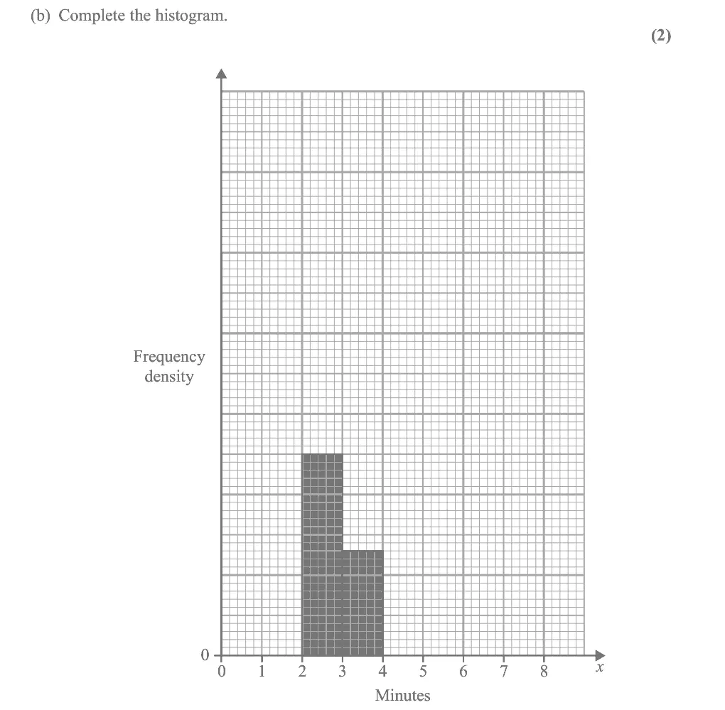
In part (b), the most usual mistake was to use frequency rather than frequency density for the heights of the 4 – 6 and 6 – 8 bars, drawing them at 7 small squares and 3 small squares respectively. Also, the first bar was often seen drawn from 0 – 2 instead of 1 – 2 often with an incorrect height.
Common mistakes
bar heights are frequency densities: 4–6 bar height 7/2 = 3.5 and 6–8 bar height 1.5
drawing heights as frequencies (7 and 3)
first bar must run from 1 to 2, not 0 to 2
June 2024 · AS Paper 2 (Statistics) · Q3(c)3 marks
Mark scheme (whole question; this part is marked with the orange bar)
Examiner's comment
Part (c) was not well done and quite often no attempt was made. Some students substituted one or more values of x, setting the result equal to the frequency (or frequency density). When integration was used, it was often done well. It was, however, surprising to see that even when the correct integration was equated to 112, many were unable to accurately solve the equation. Many students made slips with the negative signs, and some were unable to solve the equation, multiplying one side by 8 to get rid of the fraction but failing to multiply 112 by 8 at the same time.
Common mistakes
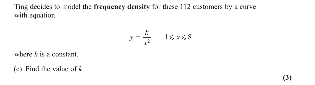
area under the frequency density curve is the total frequency: ∫ from 1 to 8 of k/x² dx = 112
(7/8)k = 112 gives k = 128
substituting x values instead of integrating
sign slips with −k/x
June 2023 · AS Paper 2 (Statistics) · Q1(a)2 marks
Mark scheme (whole question; this part is marked with the orange bar)
Examiner's comment
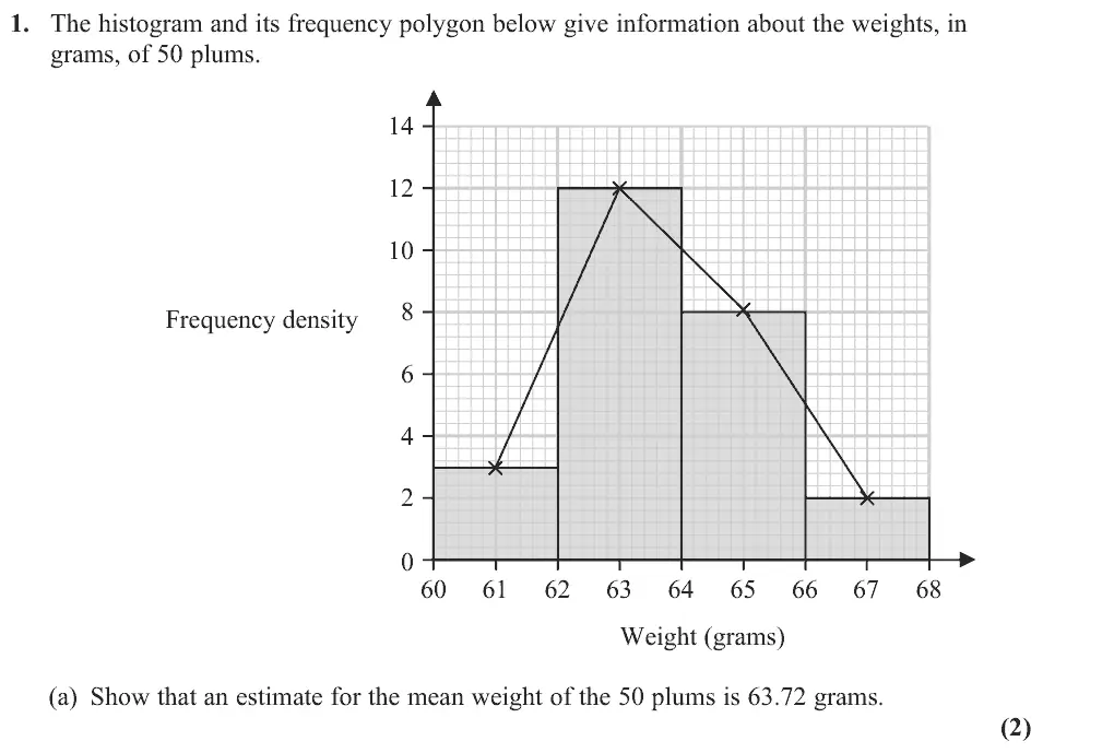
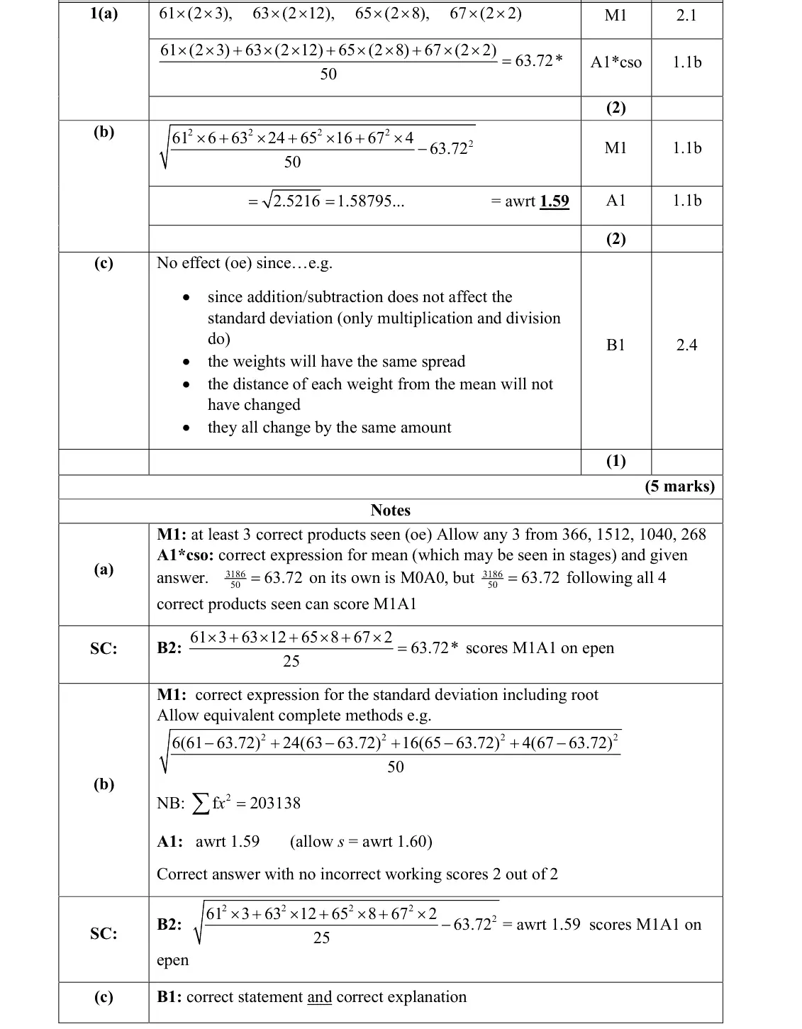
Part (a) was a generally successful start to the paper with the vast majority of students able to show sufficient calculations to arrive at the given mean. A few students opted to use the upper class boundary in their calculation. On some occasions 3186 50 was written with no supporting evidence. Some students misunderstood the demand and attempted to use interpolation to find the median instead of the mean.
Common mistakes
read the histogram: frequency = frequency density × class width 2 (3, 12, 8, 2 doubled to 6, 24, 16, 4)
use midpoints 61, 63, 65, 67, not upper boundaries
3186/50 alone with no products scores 0
some found the median instead
June 2023 · Paper 3 (Statistics) · Q6(a)2 marks
Mark scheme (whole question; this part is marked with the orange bar)
Examiner's comment
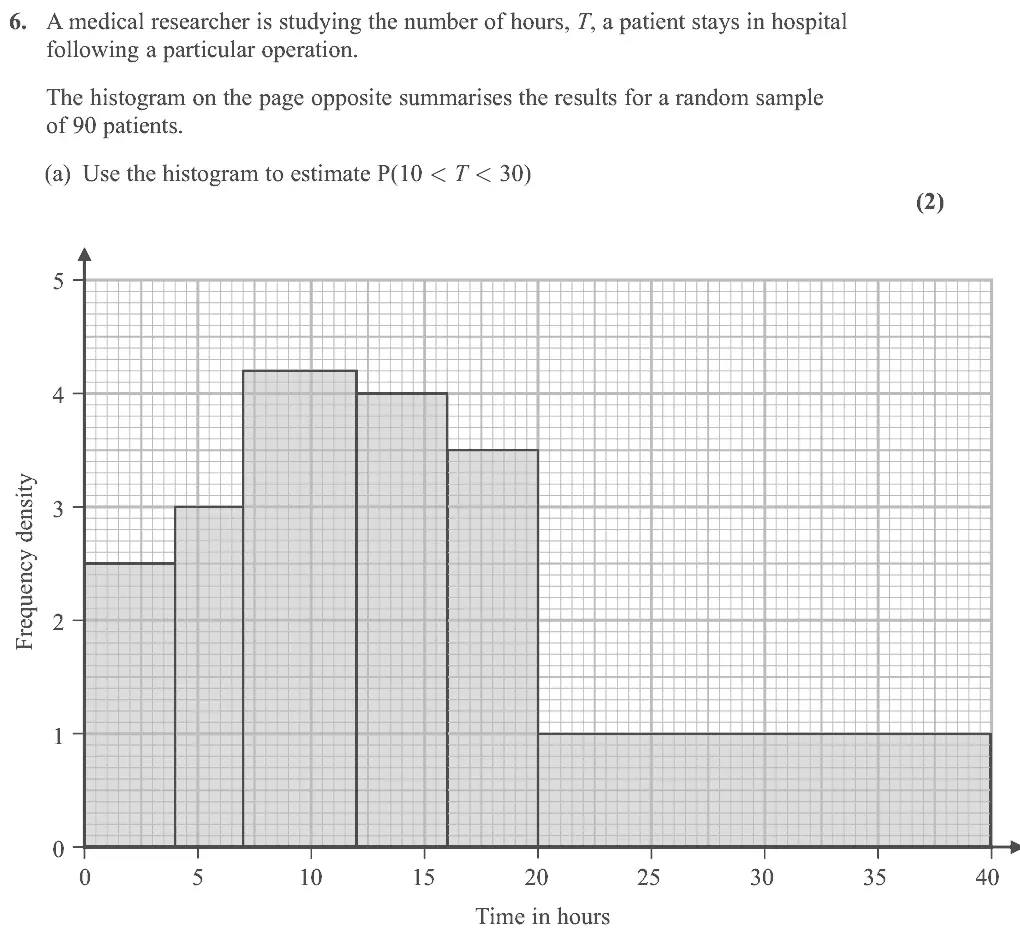
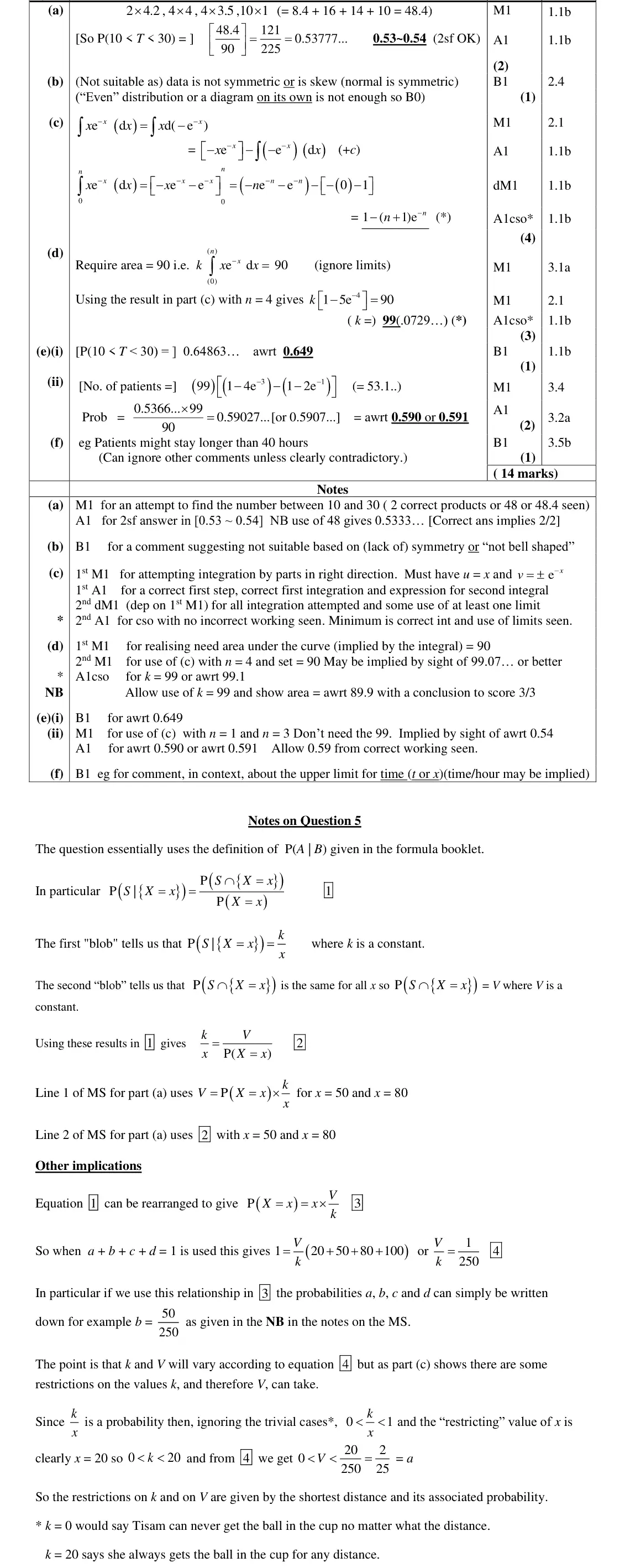
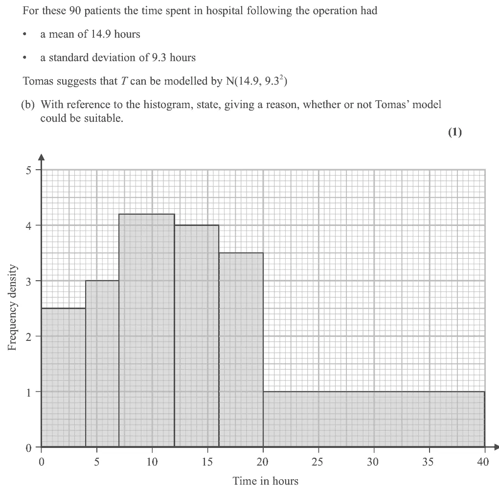
This question also proved to be quite challenging. In part (a) most students could use the histogram to calculate the number of patients spending between 10 and 30 hours in hospital but many failed to convert this to a probability by dividing by 90. Some students tried using small squares, but errors were often made and a divisor of 1600 not 1800 was often seen. Part (b) though was not The first part of (e) was often answered well and some realised that the answer to part (c) could be used to answer (e)(ii) but some tried using n = 10 and 30 and others stopped after find an estimate for the number of patients as 53.1 and failed to complete the question to find the required probability. In part (f) only a small number of candidates realised that
Common mistakes
frequency = class width × frequency density (48.4 patients)
divide by 90 for a probability
counting small squares with divisor 1600 instead of 1800
June 2023 · Paper 3 (Statistics) · Q6(b)1 mark
Mark scheme (whole question; this part is marked with the orange bar)
Examiner's comment
This question also proved to be quite challenging. often made and a divisor of 1600 not 1800 was often seen. Part (b) though was not answered so well. Some did explain that the histogram was not symmetric or was skewed and so a normal distribution wouldn’t be suitable. Some focussed on the continuous nature of the variable and thought it was therefore suitable whilst others thought that T was discrete and therefore a normal wasn’t suitable. The question wanted reference to the histogram and there was no expectation or requirement to find probabilities from the normal distribution nor compare the mean of the data with 14.9 If further calculations were expected these would be asked for and reflected in the mark allocation. Many students were able to use integration by parts correctly to establish the result in part
Common mistakes
histogram is skewed/not symmetric but the normal is symmetric
arguments about T being continuous or discrete score B0
no calculation expected
June 2023 · Paper 3 (Statistics) · Q6(c)4 marks
Mark scheme (whole question; this part is marked with the orange bar)
Examiner's comment
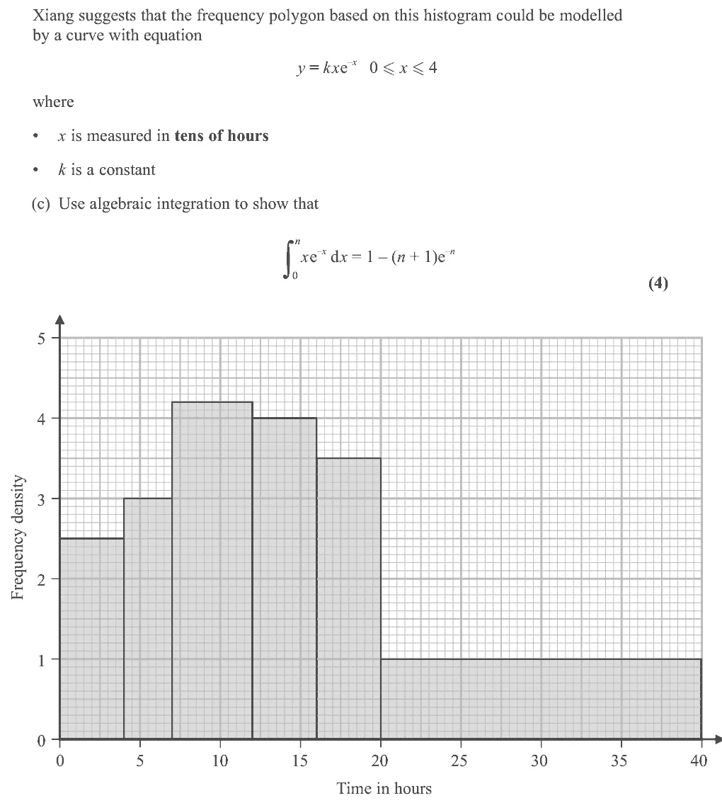
This question also proved to be quite challenging. (c). Some started the wrong way around (using u = e – x) and soon realised they were not heading for the given answer and there was some muddling over the signs when applying the limits. Part (d) was not answered so well with only a minority of students realising to apply the answer to part (c) though some used n = 40 rather than n = 4. The first part of (e) was often answered well and some realised that the answer to part (c) could be used to answer (e)(ii) but some tried using n = 10 and 30 and others stopped after find an estimate for the number of patients as 53.1 and failed to complete the question to find the required probability. In part (f) only a small number of candidates realised that
Common mistakes
integration by parts with u = x, dv/dx = e^(−x) (starting with u = e^(−x) fails)
sign errors when applying the limits
June 2023 · Paper 3 (Statistics) · Q6(d)3 marks
Mark scheme (whole question; this part is marked with the orange bar)
Examiner's comment
This question also proved to be quite challenging. the limits. Part (d) was not answered so well with only a minority of students realising that the area under the curve should equal 90. Those who did realise this were often able to apply the answer to part (c) though some used n = 40 rather than n = 4.
Common mistakes
total area under the curve = 90 patients
use (c) with n = 4 (x in tens of hours, not n = 40)
June 2023 · Paper 3 (Statistics) · Q6(e)(ii)2 marks
Mark scheme (whole question; this part is marked with the orange bar)
Examiner's comment
This question also proved to be quite challenging.
Common mistakes
use (c) with n = 3 and n = 1 (not 30 and 10) to get 53.1 patients, then divide by 90 for the probability 0.590
June 2023 · Paper 3 (Statistics) · Q6(f)1 mark
Mark scheme (whole question; this part is marked with the orange bar)
Examiner's comment
This question also proved to be quite challenging. find the required probability. In part (f) only a small number of candidates realised that the fact that some patients might stay longer than 40 hours was a limitation of the model. Others did not give any context in their answers or discussed the shape of the curve without considering the stated upper limit.
Common mistakes
model only defined for 0 ≤ x ≤ 4, so patients staying longer than 40 hours are not covered
answer must be in context, not about the shape of the curve
June 2022 · AS Paper 2 (Statistics) · Q3(a)4 marks
Mark scheme (whole question; this part is marked with the orange bar)
Examiner's comment
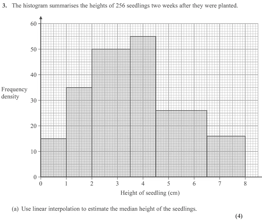
Part (a) should have been familiar territory for candidates and most did manage to list the frequencies for each of the bars though, rather disappointingly, nearly a quarter of candidates could not do this successfully with a common incorrect answer of 50 rather than 75 being recorded for the bar between 2 and 3.5 Those who did understand this important feature of histograms often went on to use linear interpolation correctly to find the median. (a).
Common mistakes
area = frequency: frequencies 15, 35, 75, 55 (common error 50 for the 2 to 3.5 bar, reading the height not the area)
median class 3.5 to 4.5
3.5 + (128 − 125)/55 × 1 = 3.55
June 2022 · AS Paper 2 (Statistics) · Q3(b)3 marks
Mark scheme (whole question; this part is marked with the orange bar)
Examiner's comment
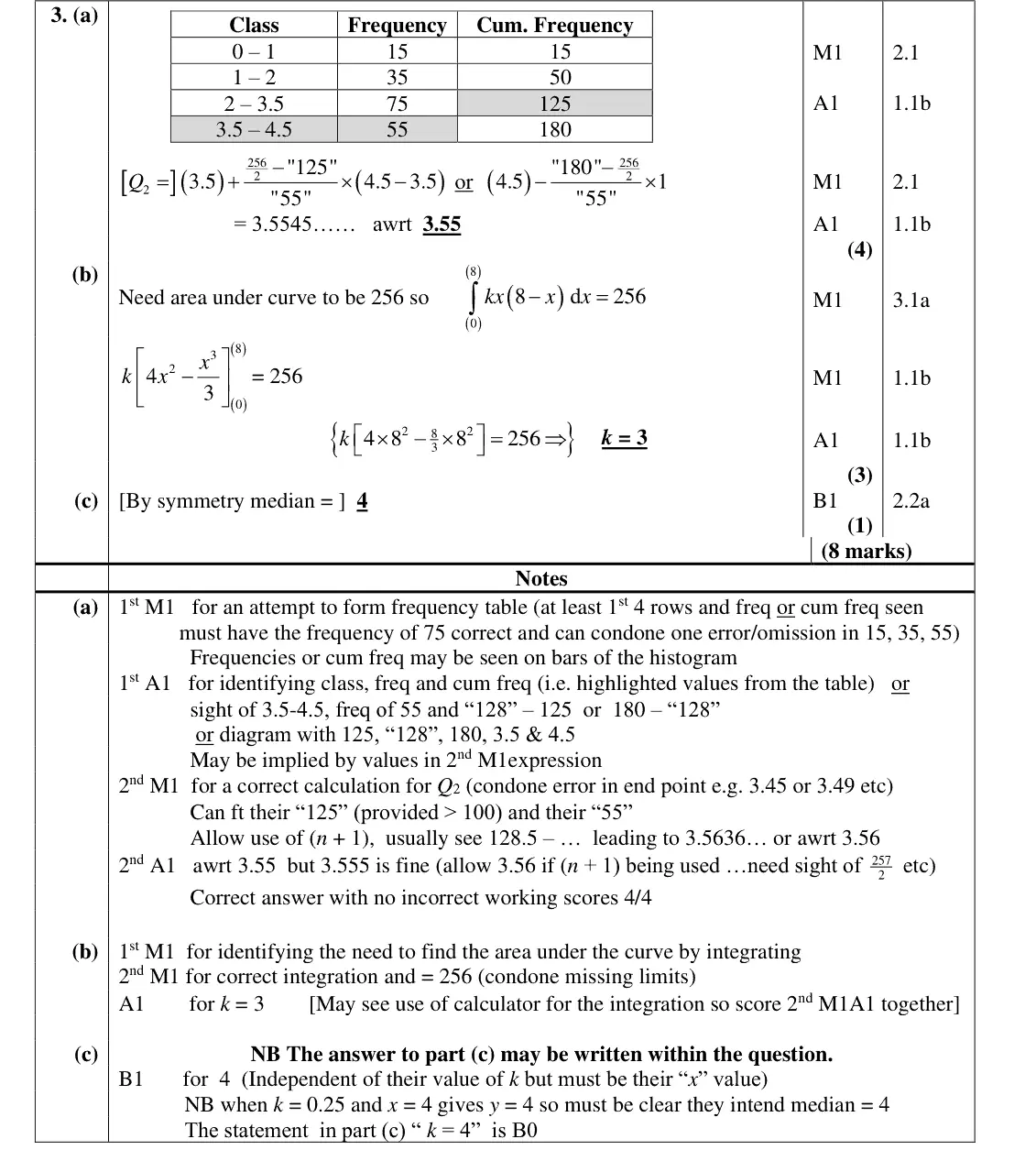
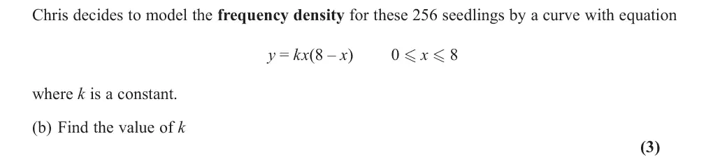
Part (b) sadly defeated almost all candidates. This was the first time we had attempted to assess the part of the specification dealing with “connect(ion) (of histograms) to probability distributions” (section 2.1). A small minority of candidates realised they needed to integrate and set the area under the curve to 256 and they often went onto achieve the correct value of k but most attempts involved differentiating the curve or solving a quadratic equation and made no progress. A few could use the symmetry of the model in part (c) to write down the median but most were completely lost after part
Common mistakes
area under the frequency-density curve = total frequency 256, so integrate kx(8 − x) from 0 to 8
k = 3
most differentiated or solved a quadratic instead
June 2022 · AS Paper 2 (Statistics) · Q3(c)1 mark
Mark scheme (whole question; this part is marked with the orange bar)
Examiner's comment
symmetry of the model in part (c) to write down the median but most were completely lost after part
Common mistakes
curve is symmetric about x = 4 so median = 4
"k = 4" scores 0
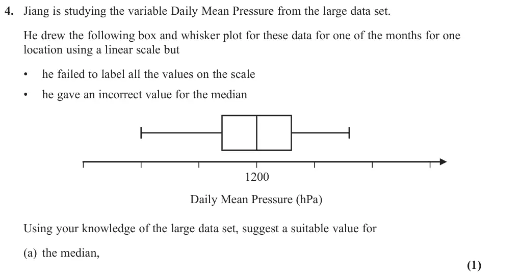
June 2022 · AS Paper 2 (Statistics) · Q4(a)1 mark
Mark scheme (whole question; this part is marked with the orange bar)
Examiner's comment
Although a few students simply left this question blank most had a go though only about a quarter scored either of the marks. The median was the most successfully answered with 1000 being a common acceptable value. Selecting a suitable value for the range was more challenging with most responses being far too large. Although the specification requires students to be “familiar” with the large data set, for this sitting it is understandable that many would not have had as much time for familiarisation as would be desirable.
Common mistakes
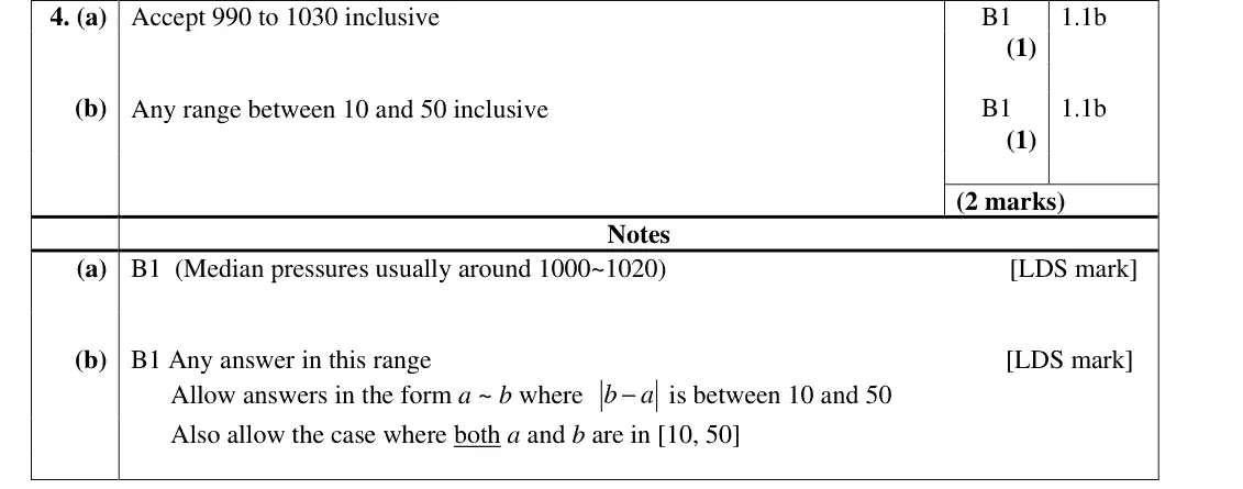
LDS daily mean pressure is around 1000 to 1020 hPa (accept 990 to 1030), not 1200
June 2022 · AS Paper 2 (Statistics) · Q4(b)1 mark
Mark scheme (whole question; this part is marked with the orange bar)
Examiner's comment
Although a few students simply left this question blank most had a go though only about a quarter scored either of the marks. The median was the most successfully answered with 1000 being a common acceptable value. Selecting a suitable value for the range was more challenging with most responses being far too large. Although the specification requires students to be “familiar” with the large data set, for this sitting it is understandable that many would not have had as much time for familiarisation as would be desirable.
Common mistakes
range of daily mean pressure in a month is about 10 to 50 hPa
most answers far too large
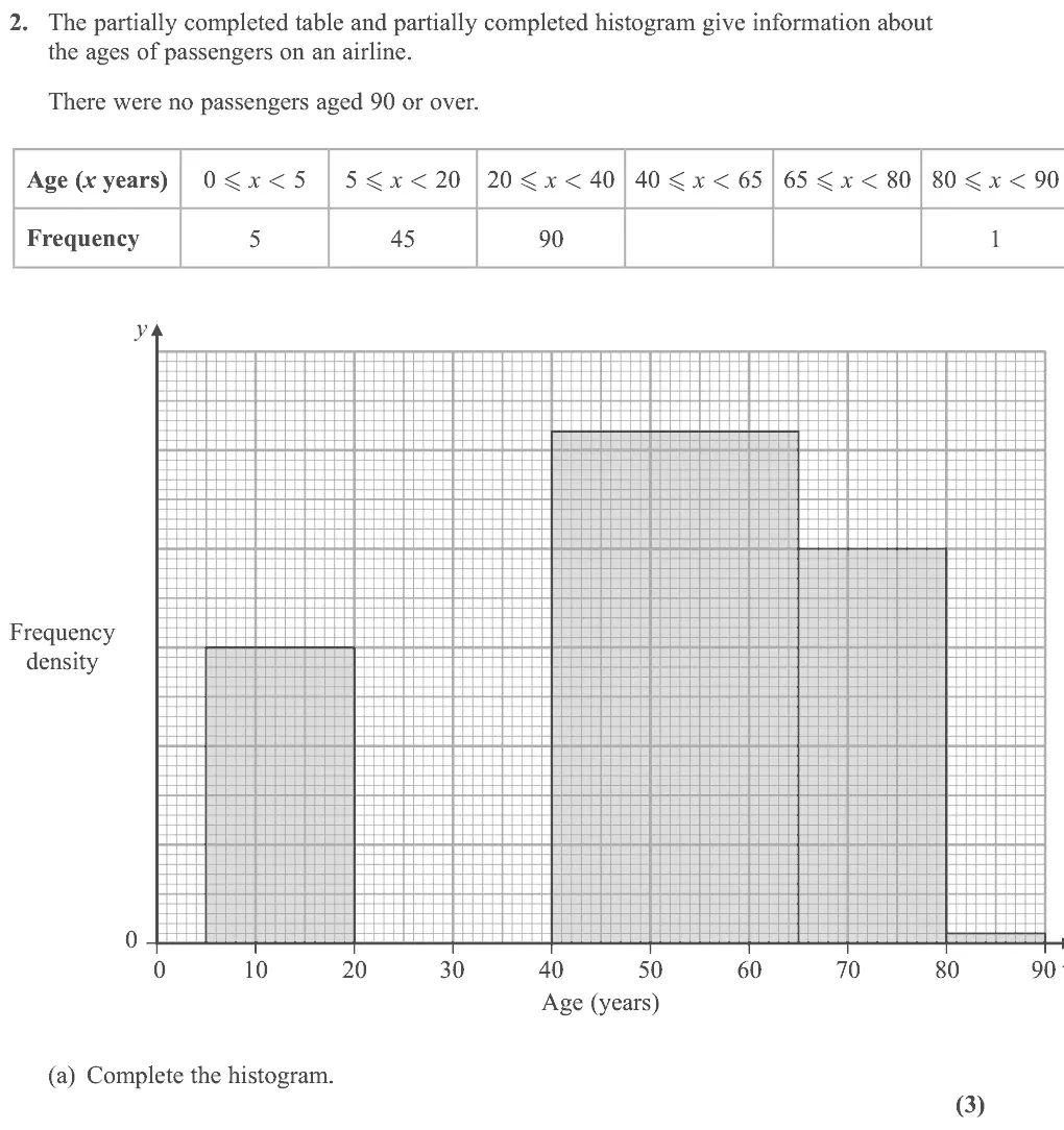
Oct 2021 · AS Paper 2 (Statistics) · Q2(a)3 marksEasy
Mark scheme (whole question; this part is marked with the orange bar)
Examiner's comment
The response to this question on histograms was much better than in previous series with over 50% scoring 7 or more marks. Most managed to complete at least one of the bars of the histogram correctly but a
Common mistakes
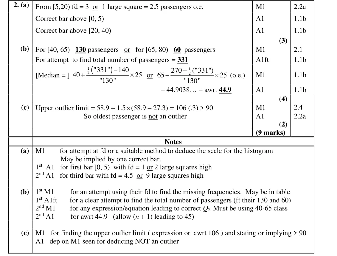
find the scale from the [5, 20) bar: fd = 45/15 = 3
bars for [0, 5) at fd 1 and [20, 40) at fd 4.5
area represents frequency
Oct 2021 · AS Paper 2 (Statistics) · Q2(b)4 marksEasy
Mark scheme (whole question; this part is marked with the orange bar)
Examiner's comment
The response to this question on histograms was much better than in previous series with over 50% scoring 7 or more marks. Most managed to complete at least one of the bars of the histogram correctly but a sizeable minority did not make any progress at all here. In part (b) many were able to complete the table correctly and find the total number of passengers. They could often go on to find the median but there were some errors in class boundaries and a fair number of very confused attempts. In part (c) most were able to
Common mistakes
read fd from the histogram to get 130 and 60, total 331
median from the 40–65 class: 40 + (165.5 − 140)/130 × 25 = 44.9
errors in class boundaries
Oct 2020 · AS Paper 2 (Statistics) · Q14 marks
Mark scheme (whole question; this part is marked with the orange bar)
Examiner's comment
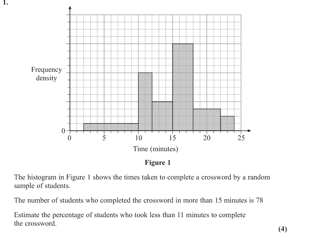
This question proved to be quite difficult with the link between area and numbers of students eluding most candidates. Whilst some candidates managed to find the number of students required, they then made no effort at finding the percentage. Working was often confused and lacking organisation which led to many using a mix of "the number of squares in a bar" and "the frequency a bar represents" when finding the total number of students. The other main error was in calculating the heights of the 4 middle bars in terms of small squares. The heights are 8, 4, 12 and 3 but were often given as 10, 5, 15 and 4.
Common mistakes
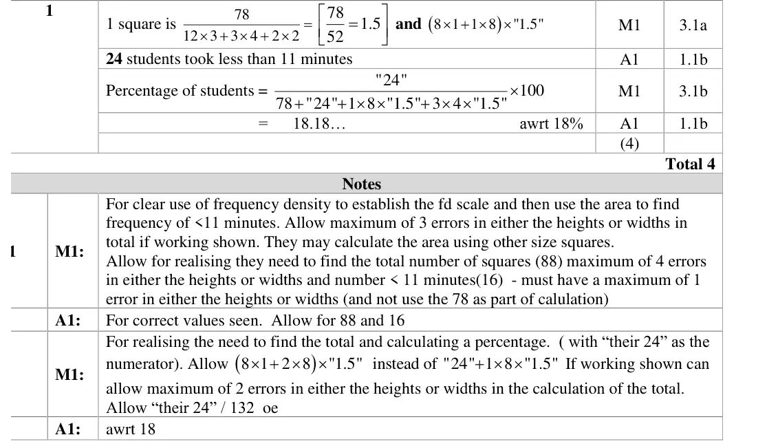
area represents frequency: find 1 square = 78/52 = 1.5 students from the bars above 15 min
bar heights are 8, 4, 12 and 3 small squares (common error 10, 5, 15, 4)
only the part of the 10-12 bar up to 11 counts (24 students)
must go on to divide by the total (132) for a percentage, about 18%
Oct 2020 · Paper 3 (Statistics) · Q3(a)1 mark
Mark scheme (whole question; this part is marked with the orange bar)
Examiner's comment
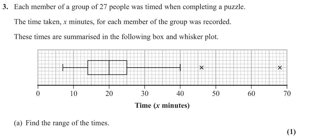
Part (a) should have been an easy start to the question but a surprisingly large number of students gave an answer of 33 by failing to consider the outliers to determine the range.
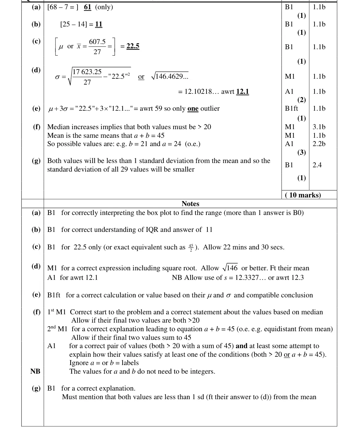
Common mistakes
range includes the outliers: 68 − 7 = 61, not 33
Oct 2020 · Paper 3 (Statistics) · Q3(b)1 mark
Mark scheme (whole question; this part is marked with the orange bar)
Examiner's comment
Part (b) though was answered very well and nearly all students answered (c) correctly. The presence of the formula for standard deviation in the formula booklet meant that a good number answered part (d) correctly although occasionally some forgot to take the
Common mistakes
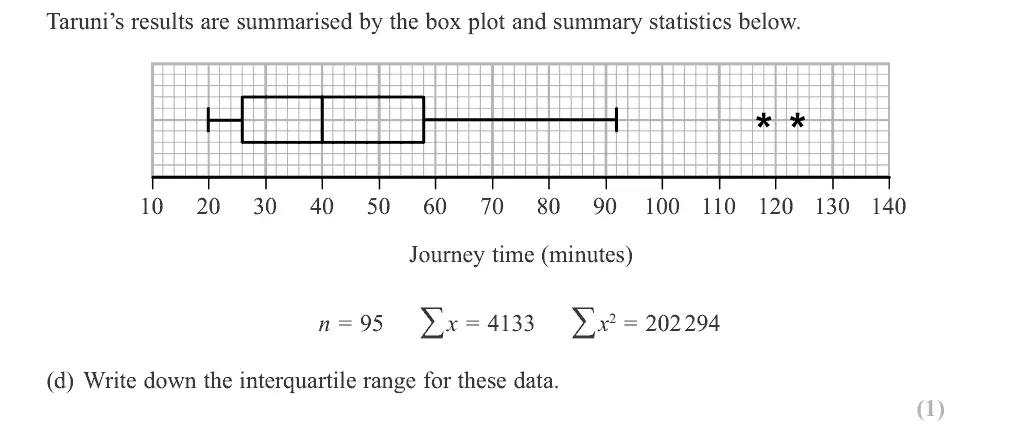
IQR = 25 − 14 = 11
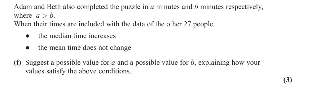
Oct 2020 · Paper 3 (Statistics) · Q3(f)3 marks
Mark scheme (whole question; this part is marked with the orange bar)
Examiner's comment
Part (a) should have been an easy start to the question but a surprisingly large number of students gave an answer of 33 by failing to consider the outliers to determine the range. Part (b) though was answered very well and nearly all students answered (c) correctly. The presence of the formula for standard deviation in the formula booklet meant that a good number answered part (d) correctly although occasionally some forgot to take the square root of failed to square the mean. In (e) most gave a suitable calculation to support their statement that Taruni would identify only 1 outlier. Some candidates used the median of 20 rather than the mean of 22.5 though. The last two parts were more challenging but it was encouraging to see a good number of attempts. Many were able to deduce that because the mean did not change then a + b = 45 but fewer were able to establish that, because the median increases, both values had to be greater than 20. Some did state these two conditions but sadly did not choose suitable values (a = 25 and b = 20 was a common error) for their final answer. In (g) many students stated that the new values would be “close to the mean” but this was not precise enough to ensure that the standard deviation would decrease. Some of the very strongest candidates did realise that because both values were within 1 standard deviation of the mean then they could be sure that the new standard deviation would be smaller. This appreciation that standard deviation represents “average distance from the mean” is clearly not well known.
Common mistakes
median increases so both values above 20
mean unchanged so a + b = 45 (e.g. 24 and 21)
a = 25, b = 20 is a common error
explain how the values satisfy both conditions
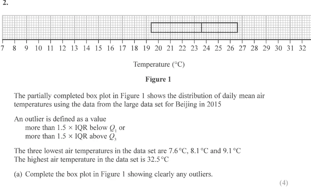
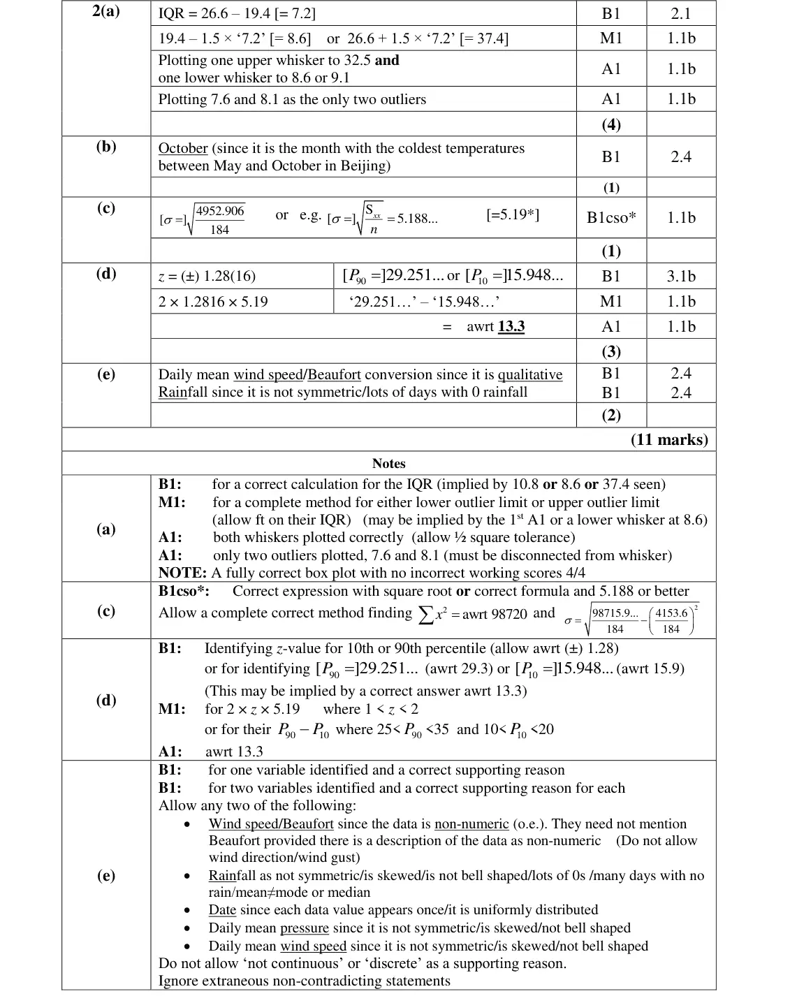
June 2019 · Paper 3 (Statistics) · Q2(a)4 marks
Mark scheme (whole question; this part is marked with the orange bar)
Examiner's comment
Parts (a), (c) were well attempted by most candidates with part (d) being tackled by more able candidates. Parts (b) and (e) were a problem for those less familiar with the large data set. In (a) most candidates correctly read the quartile values from the diagram to obtain and use the interquartile range to find outlier boundaries. (Where IQR was incorrect it was commonly given as 7.4). Surprisingly there were some inaccuracies in using the formula for outliers even though it was given. Not all candidates showed any working which meant marks could not be awarded if the box plot was not correct. The left hand whisker was commonly drawn to 9.1 (sometimes to 8.6) as required but the right hand whisker was more occasionally incorrect, often extending off the grid instead of stopping at the stated maximum value of 32.5 Usually the two outliers were plotted although they were sometimes omitted by candidates who had shown the correct calculations. Candidates are required to be familiar with the large data set. It was clear from responses in
Common mistakes
IQR = 26.6 − 19.4 = 7.2
limits 8.6 and 37.4
lower whisker to 8.6 or 9.1, upper whisker to 32.5 (not off the grid)
plot 7.6 and 8.1 as the only outliers
show working
June 2018 · AS Paper 2 · Q4(d)3 marks
Mark scheme (whole question; this part is marked with the orange bar)
Examiner's comment
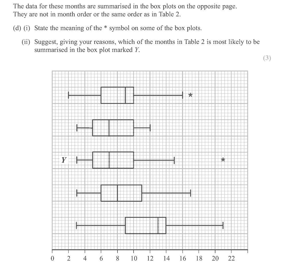
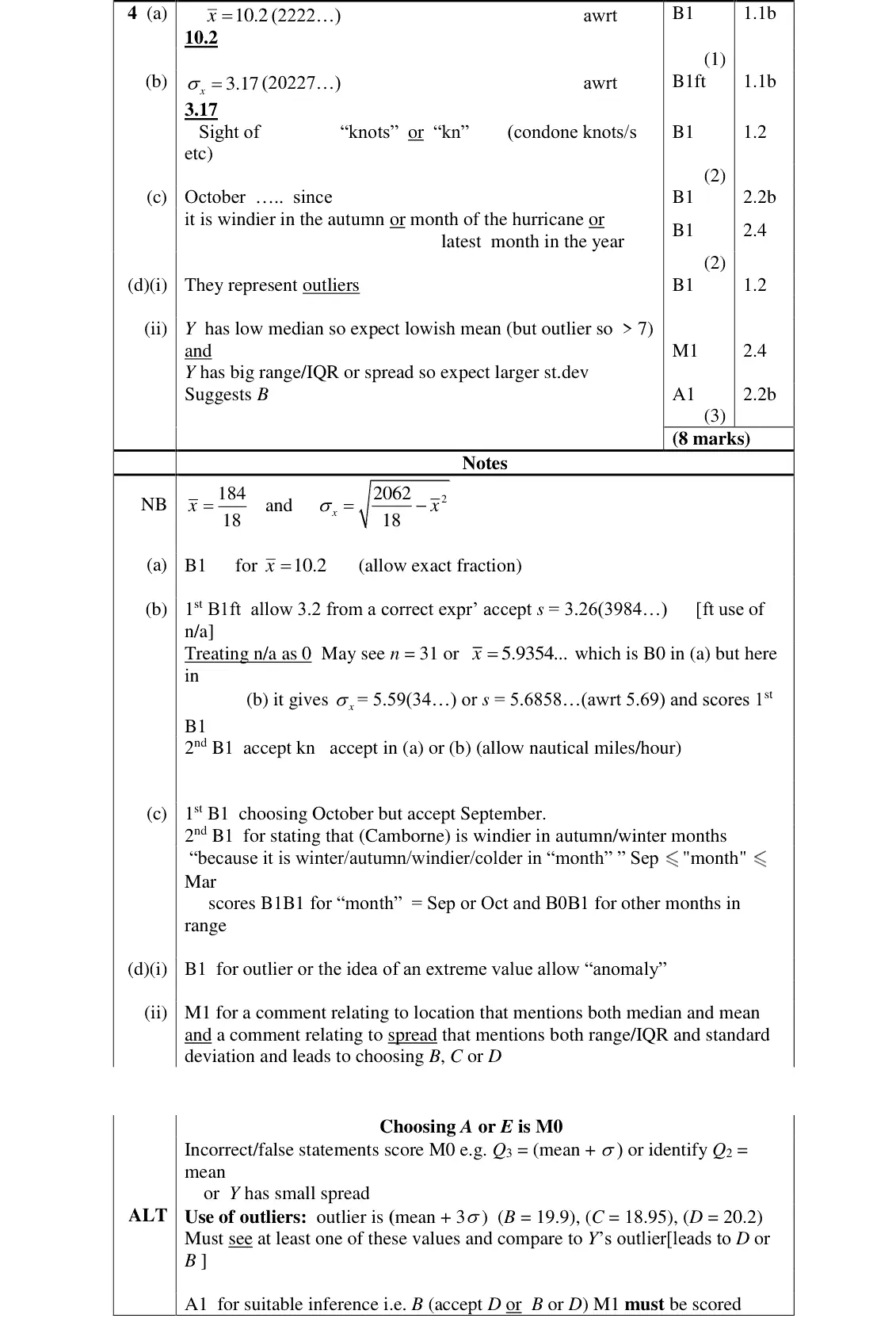
In part (c) there were many good attempts and most students gave a correct response here and in (d)(i) most knew that the * represented an outlier. Part (ii) was very challenging and required some careful thought and inference. Some confused mean with median and assumed that C and D were the 2nd and 3rd box plots in the list since they had the same medians. The intention was that they should identify E as the 5th box plot and A as the 2nd (it has a low mean and standard deviation and clearly has the smallest range on the box plots). Looking at the other 3 they should notice that the range is large and the outlier too would suggest a large standard deviation. The box plot Y has the smallest median of these 3 so a lower mean is suggested which points to B. We were looking for some explanation using correct terminology so we expected references to the mean and median and the standard deviation and a suitable measure of spread from the box plots.
Common mistakes
* marks an outlier
Y has a low median so expect a lowish mean, and a large range/IQR with an outlier so a large standard deviation: month B
do not confuse median with mean
choosing A or E scores 0
June 2018 · Paper 3 · Q4(d)1 mark
Mark scheme (whole question; this part is marked with the orange bar)
Examiner's comment
Most answered part (c) correctly and parts (d) and (e) were probably the best answered parts on the whole of section A. Part (f) was a familiar type of question from the legacy S1 specification but,
Mark scheme (whole question; this part is marked with the orange bar)
Examiner's comment
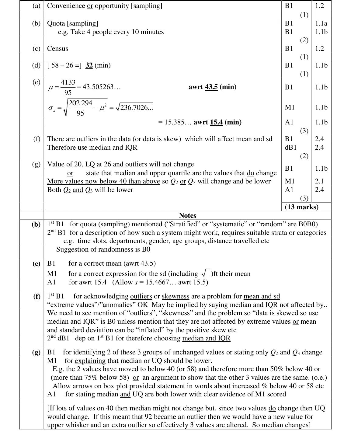
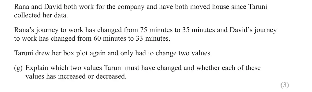
In part (g) most students identified that the median and upper quartile would change but few could give an adequate and accurate description to explain why. Many explained that the two values have moved to below 40 but failed to go on to explain that this would mean that there were more than 50% of the values below 40 and so the median of 40 would need to be lower. There were a number of students referring to changes in the mean and standard deviation despite these values not appearing in a box plot. It is hoped that over time students will get better at giving the level of detail in explanation that the new specification requires.
Common mistakes
minimum, LQ and outliers unchanged
two values move below 40 so more than 50% below 40 (and more than 75% below 58): median and UQ both decrease
mean and sd are not on a box plot
Find an Edexcel maths tutor
Stuck on this? Book a trial session with an Edexcel specialist.